Image idea
# SODA RIOT — Creative E-Commerce Landing Page
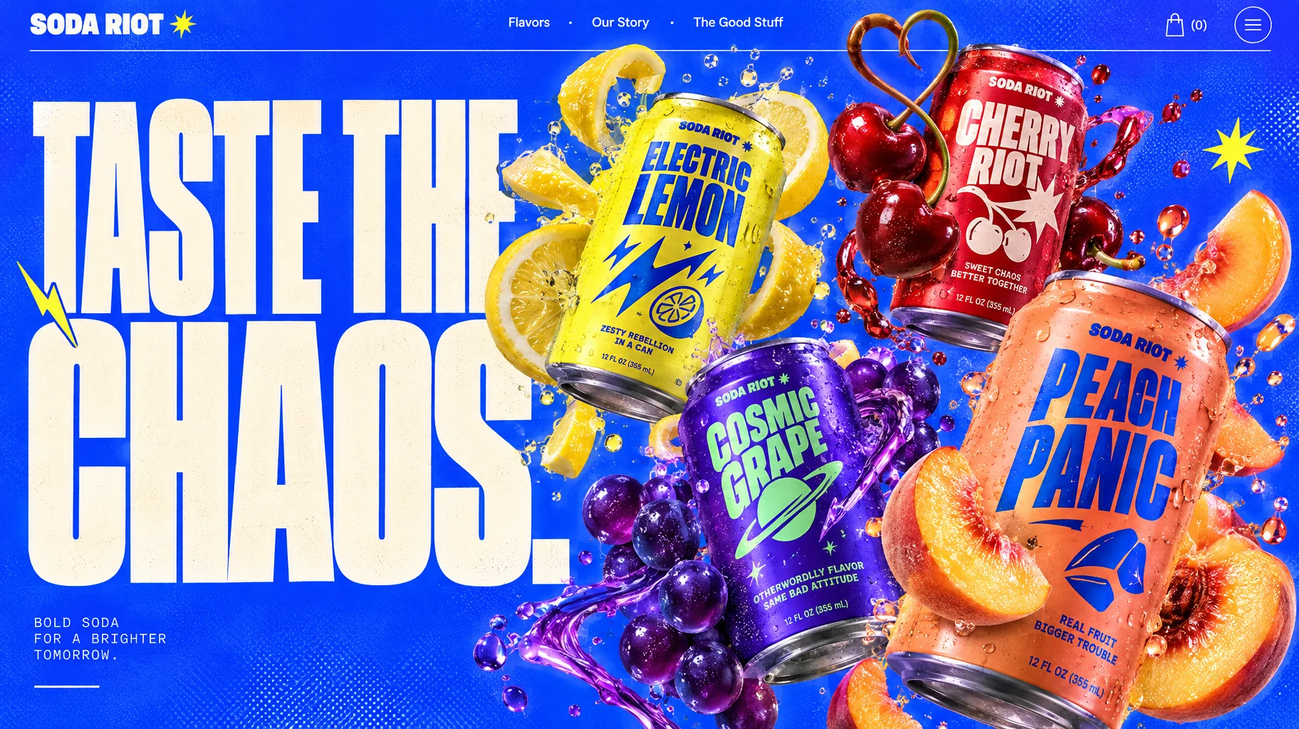
Horizontal desktop landing page hero section for a fictional rebellious premium craft soda brand called **"SODA RIOT"**. A bold fusion of experimental Swiss typography, contemporary pop-art, surreal fruit sculpture and high-end commercial beverage photography. Visually explosive, playful, energetic and unmistakably premium.
**Canvas and composition:**
Full-width horizontal 16:9 desktop website composition. Vibrant electric cobalt-blue background (#2145FF) with subtle analog print grain and faint halftone textures. Sophisticated asymmetrical editorial layout with strong typography and dramatically oversized floating product imagery.
The overall design should feel like an award-winning independent creative agency designed a revolutionary beverage brand.
**Top navigation:**
Far left: Minimal custom wordmark "SODA RIOT" in chunky white uppercase typography, accompanied by a tiny electric-yellow starburst symbol.
Center: Three clean navigation links in small white sans-serif typography: "Flavors · Our Story · The Good Stuff".
Far right: Minimal shopping bag icon with "(0)" and a small circular menu icon.
Thin horizontal white divider separating navigation from the hero.
**Massive hero headline:**
Left side, occupying approximately 55% of the composition:
"TASTE THE" on the first line.
"CHAOS." on the second line.
Extremely large, bold condensed sans-serif typography, similar to Druk Condensed or Monument Extended. Warm off-white (#FFF5DE). Tight line spacing, strong geometric letterforms and an energetic experimental editorial feel.
The word "CHAOS." should dominate, with selected letters partially disappearing behind the floating beverage products.
Small hand-drawn electric-yellow lightning graphics and tiny starburst accents add dynamic visual tension.
**Main 3D product composition:**
On the center-right, create a spectacular gravity-defying explosion of four premium aluminum soda cans surrounded by surreal, oversized fruit sculptures.
Each can has a distinctive original label design, with bold typography, expressive abstract illustration and striking color combinations.
**Can 01 — Electric Lemon**
Bright acid-yellow aluminum can with deep-blue typography and graphic lightning illustrations.
Surrounded by enormous glossy lemon slices twisting into impossible spiral shapes. Transparent lemon juice droplets levitate in the air.
The can tilts diagonally toward the viewer, revealing a highly realistic metallic rim and condensation.
**Can 02 — Cherry Riot**
Glossy cherry-red can with cream typography and mischievous retro-inspired graphic patterns.
Two gigantic shiny cherries orbit the can, their stems curling together into a sculptural heart-shaped form.
Tiny translucent red liquid splashes hover around the composition.
**Can 03 — Cosmic Grape**
Deep ultraviolet-purple can with bright mint-green graphic lettering and abstract planetary artwork.
Floating clusters of translucent purple grapes resembling polished glass sculptures, with beautiful subsurface scattering and light refraction.
A ribbon of violet liquid wraps dynamically around the can.
**Can 04 — Peach Panic**
Warm coral-orange can with contrasting cobalt-blue typography and minimal geometric illustrations.
A perfectly ripe peach is dramatically split open, revealing hyperrealistic juicy flesh. Floating peach wedges and tiny suspended droplets surround it.
The can sits slightly closer to the camera than the others, creating dramatic depth.
**Product arrangement:**
The four cans form a dynamic asymmetrical composition on the right two-thirds of the layout, with alternating angles, overlapping fruits and dramatic scale differences.
The products appear suspended in zero gravity during an energetic explosion of flavor.
No visible supporting surfaces.
Highly realistic aluminum materials, tiny condensation droplets,